Which Newsletter Design Do You Like?
The Pennsylvania Academy of Dermatology and Dermatologic Surgery (PAD) asked for three concepts to present in order to keep up with the needs of their growing membership to view communications optimally on their electronic devises.
Concept 1:
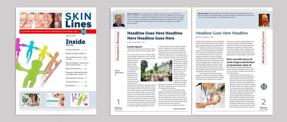
I describe this design as a cross between a newsletter and magazine cover. The idea is to include what is inside on the first page so members can quickly access the information they are interested in by a click. Images used in the three boxes on the cover across the bottom will be symbolic to the core mission: 1) Advocacy 2) Education and Engagement and 3) Membership.
Concept 2:
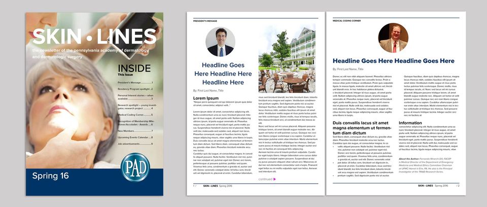
This
design leans more toward a book/magazine appearance. The title of the publication appears at the top in a type treatment. This image can change relevant to the main feature or you may keep the same image for all issues. I have used circles (spots) to contain the author’s images (to match the logo format).
Concept 3:
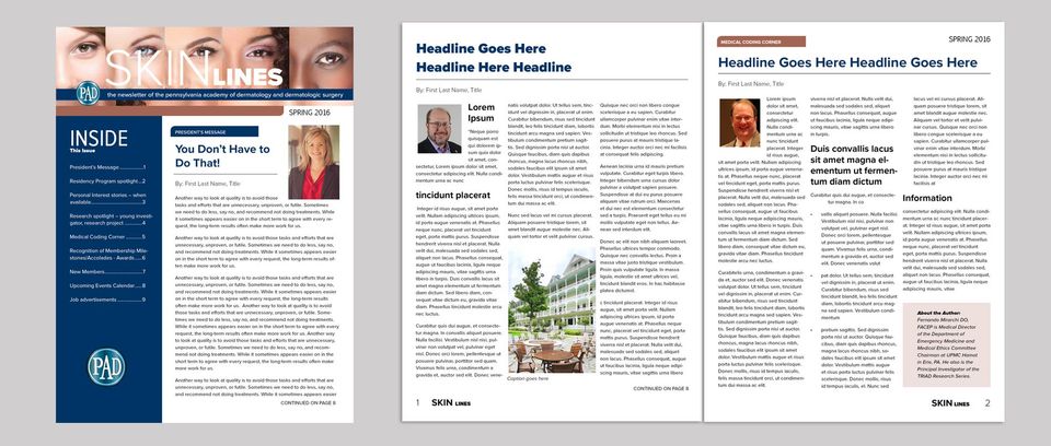
This design is more traditional to a newsletter format that has been done in the past but has been given a fresh new look and feel. Formatting follows specifications and guidelines to view better on electronic devices by PAD members.